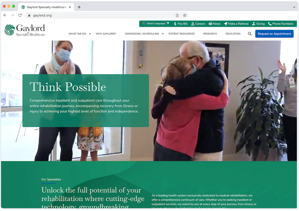
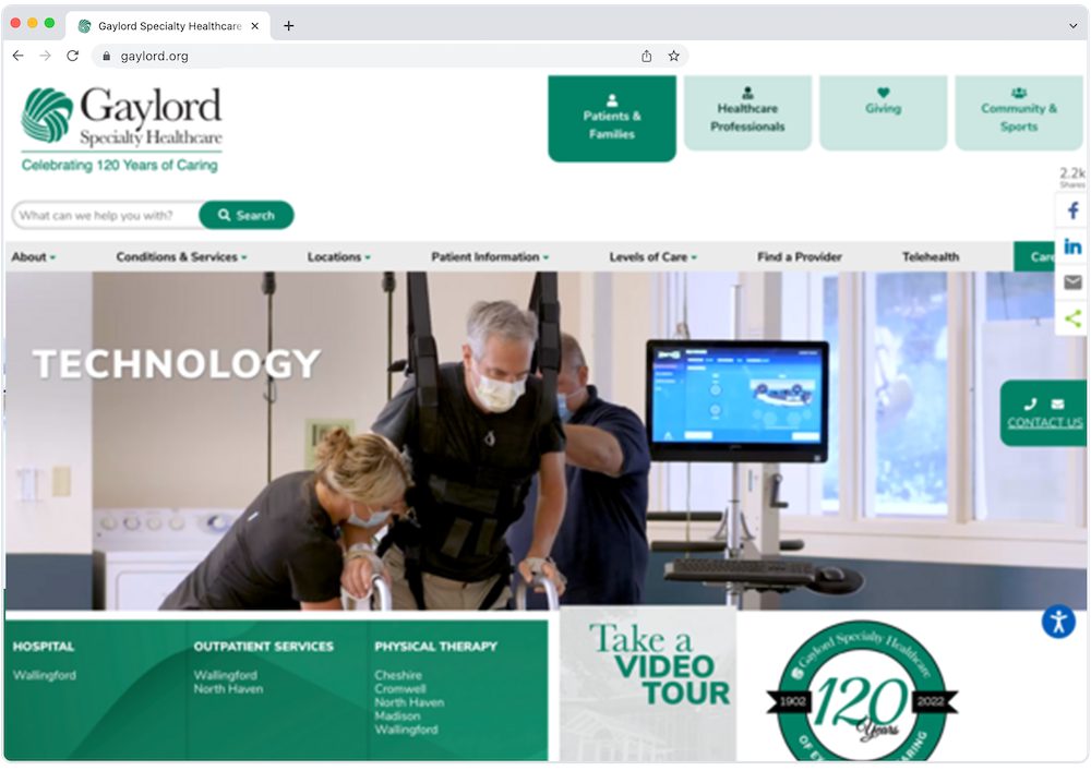
For patients facing life-altering conditions, finding the right information is crucial. As a leader in brain and spinal cord injury rehabilitation, Gaylord Specialty Healthcare (GHS) recognized that its outdated website wasn’t providing the seamless experience necessary for patients, caregivers, and healthcare professionals to make informed decisions. By redesigning their site with an emphasis on user experience, accessibility, and comprehensive content, GHS transformed its website into an intuitive resource, streamlining access to essential services and reinforcing its commitment to compassionate, expert care.


Challenge: Fragmented Website Experience Left Critical Services Misrepresented and Information Hard to Find, Causing Confusion Among Users and Hospital Team
Using client interviews and raw site data, we identified the following key focus areas:
Messy Site Structure
The original site had a disorganized structure, containing over 800 pages with two levels of navigation that varied depending on the page you were on. This created a convoluted, repetitive layout that was difficult to navigate and understand.

Poor SEO
The site's SEO setup had significant issues with page titles, meta descriptions, and broken links, which severely impacted search engine rankings and made it difficult for potential visitors to find GHS’s services online.

Challenging UX
Multiple navigation areas and service pages lacking sufficient context meant visitors struggled to find relevant information, causing a disjointed and frustrating experience.
Outdated Design
The outdated design failed to convey their advancements and current offerings, causing a mismatch between their online representation and actual capabilities.

Lack of Internal Editing Control
The complex backend architecture in WordPress made changes cumbersome for the marketing team. The lack of cohesion among the multiple teams working on the same site led to inconsistencies, inefficiencies, and delays.
No Call to Action
The absence of a clear CTA meant missed opportunities to direct users toward desired actions. Without a primary conversion path, efforts to generate leads and engage patients were hindered.
Solution: Rebuilding the Website With HubSpot Content HUB
Streamlining the Site Structure
To address the messy site structure, the redesign included several key improvements:
1. Creating a Consistent, Static Navigation
A single navigation bar was implemented to simplify the menu, making it easier for users to find what they were looking for without feeling overwhelmed by too many options.

2. Developing Dedicated Sub-Sites to Add Clarity
The redesign introduced sub-sites for sub-sections whose audiences varied greatly from the main site, such as community adaptive sports programming and donation areas. This facilitated a more structured layout and established specific zones for specialized content, navigation, and internal teams.

3. Content Cleanup & Consolidation
The redesign involved consolidating similar pages into comprehensive, value-packed sections which made the site more cohesive and easier to navigate, providing users with a richer experience that eliminated redundancy and presented information in a more accessible manner.
Enhancing SEO
The redesign involved a comprehensive overhaul of both technical and content SEO elements to boost organic traffic, search engine rankings, and online visibility.
1. Moving to HubSpot Content HUB
Migrating to HubSpot Content HUB laid a strong SEO foundation with its optimized infrastructure and themes, enabling advanced strategies and continuous improvements. This boosted search performance and simplified maintenance for long-term success in attracting and retaining visitors.
2. Implementing Technical and On-Site SEO Best Practices
On-site SEO updates boosted the website's performance and visibility. Each page received a unique, optimized title and meta description, ensuring that users could easily discover the content when searching online.
Technical SEO was another critical area addressed. Various backend issues, such as page load times and sitemaps, were analyzed and optimized. Once addressed, the result was a faster, more efficient user experience and better search rankings.

3. Fixing Broken Links
All internal and external links were audited and fixed if necessary. By ensuring that all links were functional, the bounce rates were reduced, which in turn improved the overall user experience.
Improving User Experience
Several significant changes were implemented to enhance the overall site’s UX.
1. A Clean Design
Engaging visuals and streamlined text played a crucial role in the updated design. This redesign made the site more visually appealing and easier to read.
2. A Clear Conversion Path
A clear main conversion path was established with a prominent call to action—request an appointment. This feature was designed to guide users seamlessly toward making contact, increasing the likelihood of conversions and ensuring that visitors could easily take the next step in their customer journey.
3. HubSpot Content HUB for An Empowered Team
The new HubSpot site facilitated easy front-end editing, significantly reducing the workload for the team and enabling them to manage and update the site more effectively without extensive technical expertise. 
Results: Increased Traffic, Engagement, and Conversions
After the launch of the new site, GHS saw significant increases in user engagement. Combined with a boost in conversions, the new site not only kept more visitors on the site longer, but also effectively drove them to take desired actions. Additionally, improved visibility through search engines expanded the site’s reach, attracting more potential customers and enhancing the hospital's ability to deliver compassionate care.

Impact: A Better Website Experience That Empowers The Marketing Team
Video Testimonial: Tara Knapp - Vice President of External Affairs
The redesigned website both enhanced the patient experience and empowered GHS’s team to better uphold its commitment to compassionate, expert care. Intuitive front-end editing features streamlined content updates, allowing the team to keep the site current with minimal effort and ensuring patients and caregivers always have access to the latest, most accurate information—critical for effective care planning. The new platform also improved cross-team collaboration by clarifying roles, streamlining workflows, minimizing friction and boosting efficiency. Plus, with HubSpots’s seamless data integration, GHS now tracks performance metrics with unmatched reliability. This enables the hospital to make data-driven decisions that enhance patient outreach and improve overall service delivery.


