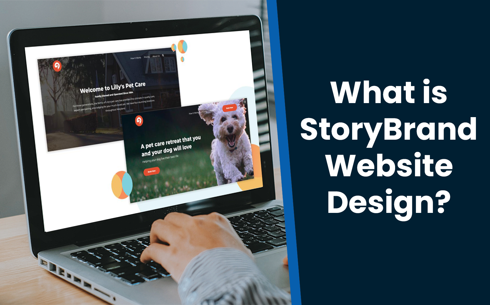
What is StoryBrand and How to Structure Your Website’s Homepage
The StoryBrand methodology relies on the fundamentals of storytelling because stories help people make sense of things. Created by Donald Miller, the concept behind StoryBrand is that humans as a whole are hardwired to look for stories. Knowing this, researchers were able to produce a sort of formula to help marketers develop clear messaging that speaks to customers effectively.
Based on the StoryBrand methodology, what should live on each section of your homepage?
Check the StoryBrand Book here for more information: Building a StoryBrand: Clarify Your Message So Customers Will Listen
Related Blog: HubSpot Content Hub Websites for Marketers: Templates, Themes and SEO Optimization
StoryBrand Homepage Section 1: The Header
The first item you should include in your header section is your logo. That might sound obvious, but it is very important to make sure your logo is easy to spot and consistent across your site. The logo serves many purposes, like reinforcing brand recognition and offering your visitors a sort of home base they can click on throughout your site to bring them back to the homepage.
The second element that should be on your header section but that is often missed is a clear statement of what your customer wants. The biggest and boldest statement on your site should be really clear messaging that speaks directly to what your customer is looking for on your site. In the example featured above, you can easily understand that the company is going to bring your outdoor space to life and they’re going to do that with an aluminum pergola. We like to think of this first section of the homepage as the grunt test - a customer should be able to read this section and quickly grasp what you’re offering. If not, you run the risk of losing customers right off the bat. So make sure you’re speaking to what your customer is looking for as clearly as possible.
Right under your statement, you should feature a brief description of what you do. For example, “We help Sarasota and St. Pete homeowners create their dream outdoor living spaces with StruXure aluminum pergolas and cabanas.” You want to make sure you’re focusing on the customer and what you can do for them, but there is a bit more room for you to plainly state your business services.
Think of this first section of your homepage as your first opportunity to attract potential customers. You want to make a great first impression and make it as easy as possible for your customers to understand how you can help them. A Storybrand tip that we have found to be very helpful is making the customer the hero and you, as the business, their guide. You are helping the customer achieve the success they’re looking for so when writing the content for this initial section, focus on what they need help with and how working with you would solve that problem.
Lastly, you absolutely need to include a clear call to action in both your navigation bar as well as in your first section, front and center. You want to make it as simple as possible for your customers to do business with you and a great way to do that is through a call to action that is easy to understand and see on the page.
The last tip we have for this section is to include an image of a person smiling on your header image. The concept behind this is that humans connect with humans, so consumers want to see images of people using your products and enjoying them. That will help them visualize how you can help them too!
StoryBrand Homepage Section 2: The Value Stack
The next section you’ll want to include on your website is the Value Stack, which consists of just three simple successes that your customer will experience if they choose to work with you. Think of this as a quick overview that will help your readers see how your company can make their lives better. This section also helps increase the perceived value of your product or service, in a bite-sized, easy-to-understand format.
StoryBrand Homepage Section 3: The Stakes
Here is where you have a great opportunity to speak to your customer instead of at your customer. We frequently see companies making the mistake of speaking at their customers, especially on their websites. By “speaking at” versus “speaking to” customers, the company is not taking the time to understand the concerns of their customers and instead, is using their homepage for things like stating their company history or listing their experience in the field. You want to take advantage of this prime real estate by speaking to your customers about their struggles and how you can help solve them.
StoryBrand Homepage Section 4: Your Value/Services
In this section, you should present the value or services you can provide to customers to solve their problems. This can be the value you bring to your customers, a few of your services, or the benefits they can expect from working with you. By this point, you’ve already shown your customers that you understand their problems and in this section you can show them how you’ll help them solve those problems.
StoryBrand Homepage Section 5: Authority
This section is where you should show your prospective customers that you are qualified to solve their problems. The authority section of your website includes things like customer testimonials, awards and certifications, clients you’ve worked with in the past and press you’ve been featured in. For customer testimonials, we recommend keeping those short and sweet because statistically, people don’t read lengthy pieces of information; instead, they skim through. So it’s in your best interest to make what they are reading as powerful as possible!
StoryBrand Homepage Section 6: Plan
The goal of this section is to ease your customer into working with you, and you accomplish that by explaining what that process would look like. People have a natural tendency to be hesitant and overwhelmed about the unknown. So by clearly listing what their next steps would be, you’re immediately going to put your customers at ease.
Not sure where to begin? We suggest utilizing a step-by-step model as shown above, and matching that first step with the call-to-action you have on the top right and center sections of your homepage. This acts as the main call-to-action you have your site optimized for, so it should be consistent across the board. Maintaining that consistency also eliminates the confusion your customers might feel if they see different call-to-action options and don’t know which to select. For the second step, you would have to determine what is relevant to your company and industry– this could be “Get a Custom Solution” like the example above. For the last step, consider a valuable benefit your customer would experience from working with you such as “Enjoy your new outdoor space” or “Free up your time and focus on your business.” Stating this as the last step would help reestablish that positive result.
StoryBrand Homepage Section 7: Call to Action
This is the final section of your homepage, and if this prospective customer has made it to the bottom of the page you want to take that opportunity to nurture them. By “nurture,” we mean direct them to another page on your website that has some sort of form experience. This form should offer them something in return for their information, such as a pre-qualification call like the example above, a link to take a quiz, or a downloadable asset such as a guide or brochure.
HubSpot Content Hub Updates
The HubSpot Community is a wonderful resource for anyone hoping to learn more about using Content Hub and utilizing it as a marketing tool. The community board is great for sharing thoughts, ideas, asking questions, and connecting with other people all around the world.
Recently, one of our group members shared a couple of books about CSS that were beneficial for her, and we wanted to share them with you! Check out our community board here.
Join our Content Hub for Marketers HUG to learn more about how you can use the HubSpot Content Hub to create beautiful and high-performing websites. We will guide you through the entire process of developing a website and discuss topics such as how to utilize various design tools, optimize your site, and determine messaging that fits your brand, templates, low-code website design, SEO, user experience, and conversion optimization.


